

A Website for Newcomers to this city
A website that can aggregate rental prices and housing location information for a specific area, making it easier and more convenient for newcomers to find housing.
by Ye Yichen• yichen.ye.24@stu.hainan-biuh.edu.cn
Description
This is a website for collecting and displaying rental information, designed specifically for newcomers to the local area. Its purpose is to provide rental options that better meet users' needs. The website offers the following interfaces: a main interface for reading introductions and searching for rentals by region, and a sub-interface that opens after searching or clicking, displaying detailed rental information along with corresponding images. What sets this website apart is its ability to collect and aggregate information from rental websites across different regions and present it in one place. Users can conveniently browse rental listings from various areas on this platform to select the optimal rental solution. The website's structure is built using HTML, CSS, and JavaScript, adopting a responsive design approach. Special technologies or libraries used are as follows: 1. Data layer: Sample data is stored as an inline array in script.js (const rentalData = [...]). There is no backend API, so data is directly loaded and filtered on the client side. 2. Search function: Implemented by searchRental() in script.js. 3. Exact matches (case-insensitive) will redirect to the corresponding page via window.location.href = ${exactMatch.location}.html; otherwise, it performs partial matches and renders filtered results on the current page through displayRentals. 4. Rendering: displayRentals(data) dynamically creates DOM nodes (li) and inserts them into #rental-info. 5. Inter-page navigation: City-specific pages are linked to each other through static links (e.g., <a href="Shanghai.html">Shanghai</a>). 6. Styling and layout: .right-gallery uses fixed positioning, and body { padding-right: 180px; } creates spacing to avoid content obstruction. 7. Responsiveness: On narrow screens (max-width: 900px), the side gallery is hidden and the right-side spacing is removed. No build tools: The repository contains no package.json, build scripts, or backend code; deployment as a static site is straightforward (either direct hosting or using a static server). The website features a minimalist visual style, with a color scheme and font contrast that are strong enough to allow users to grasp key information at a glance and facilitate quick understanding.
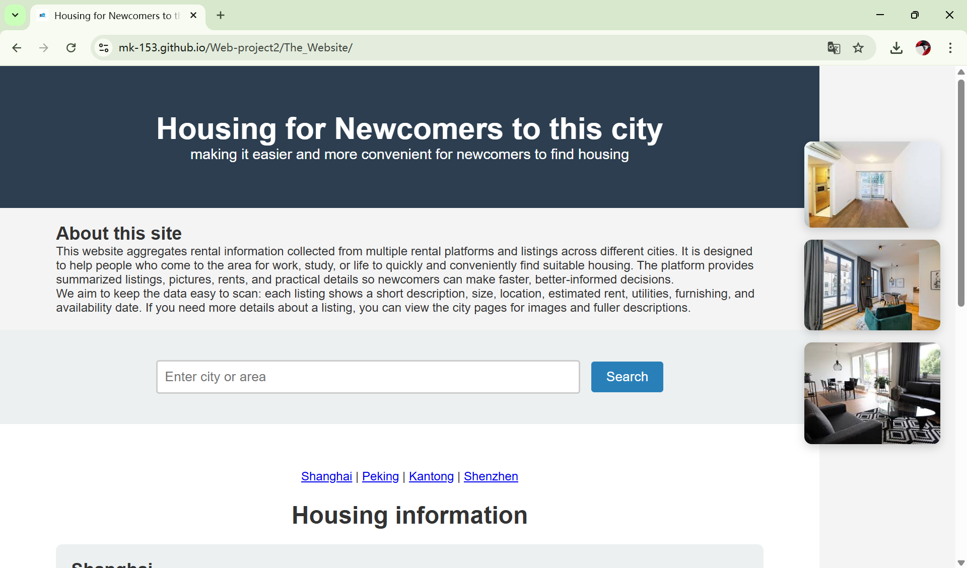
Desktop Homepage
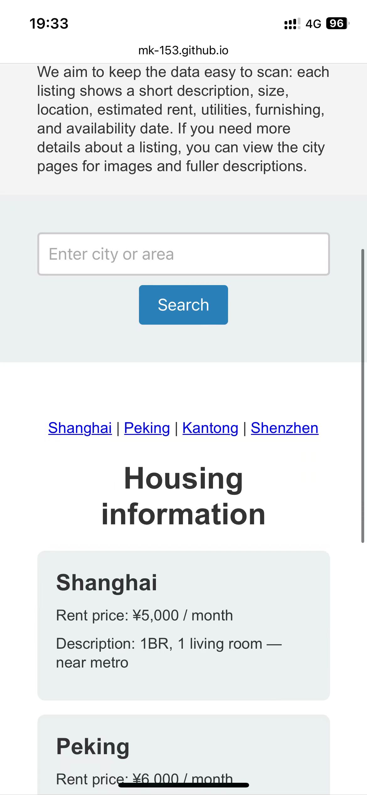
Mobile Homepage
Open Graph Image
Favicon