5.1: Website Planning & Prototyping
Learn how to plan a successful web project by defining goals, identifying your target audience, and creating wireframes. Understand the importance of proper planning before writing code to ensure your website meets user needs and project objectives.
1. Project Goals & Target Audience
Before writing any code, successful web projects start with clear planning.
Defining Project Goals
Ask these key questions:
- Purpose: What is the website's main objective?
- Portfolio to showcase work?
- Personal blog to share ideas?
- Business landing page to attract clients?
- Educational resource to teach others?
- Success Metrics: How will you measure success?
- Number of visitors?
- Contact form submissions?
- Time spent on page?
- Social shares?
- Timeline: When does it need to be complete?
- Deadline for job applications?
- Event or product launch date?
- Personal learning milestone?
Example: Personal Developer Portfolio
Goal: Create a portfolio to showcase web development skills
Target: Potential employers and clients
Success: 3 contact requests per month
Timeline: 2 weeks to complete MVP
Understanding Your Target Audience
Create a user persona:
Name: Tech Hiring Manager (Sarah)
Age: 35-45
Tech Savvy: High
Goals: Find skilled developers quickly
Pain Points: Too many resumes, needs to see real work
Devices: Desktop (70%), Mobile (30%)
Expectations: Fast loading, clean design, easy navigation
Key audience questions:
- What devices do they use? (Mobile-first design?)
- What's their technical expertise? (Simplified navigation?)
- What information do they need? (Contact info prominent?)
- What actions should they take? (Clear call-to-action buttons?)
2. Wireframing Basics
Wireframes are simple sketches of your website layout before adding design or content.
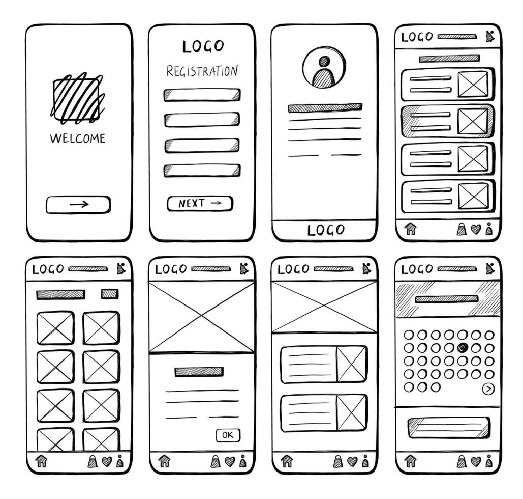
Low-Fidelity Wireframes (Lo-Fi)
Characteristics:
- Black and white only
- Boxes and lines
- Placeholder text ("Lorem ipsum" or simple labels)
- Focus on layout, not details
- Quick to create (pen and paper or basic tools)
Wireframe Examples:
Here are two different approaches to wireframing your website layout:
Desktop Website Wireframe:
Mobile Website Wireframe:
When to use:
- Initial brainstorming
- Quick iteration
- Team discussions
- Concept validation
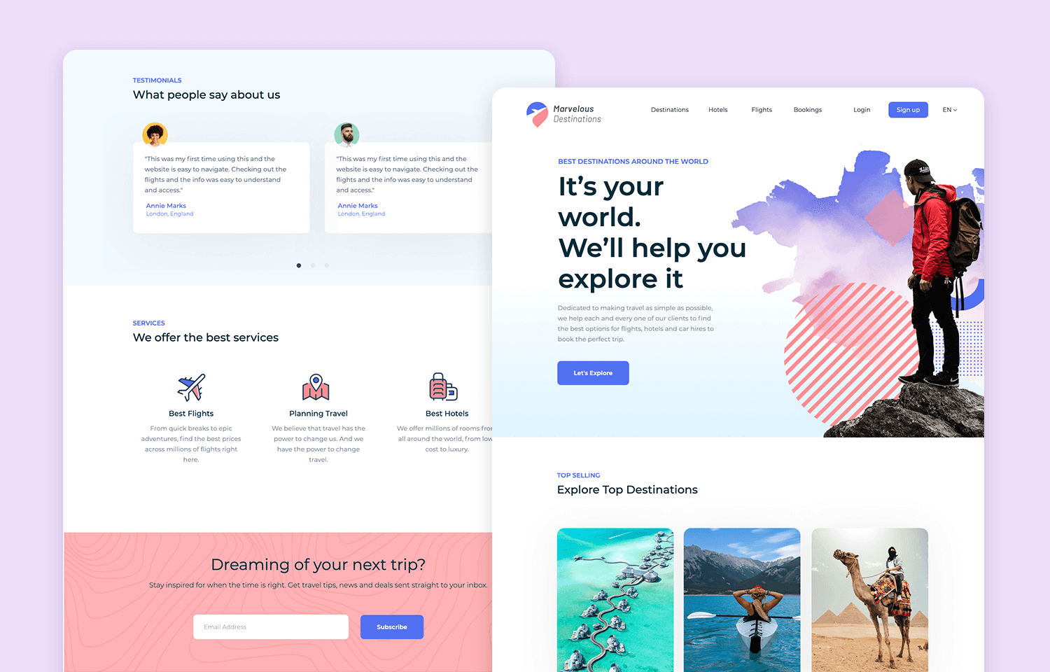
High-Fidelity Wireframes (Hi-Fi)
Characteristics:
- Realistic proportions
- Actual content or close approximations
- Interactive elements shown
- Typography hierarchy visible
- Color schemes applied
- Near-final design
Tools for Hi-Fi Wireframes:
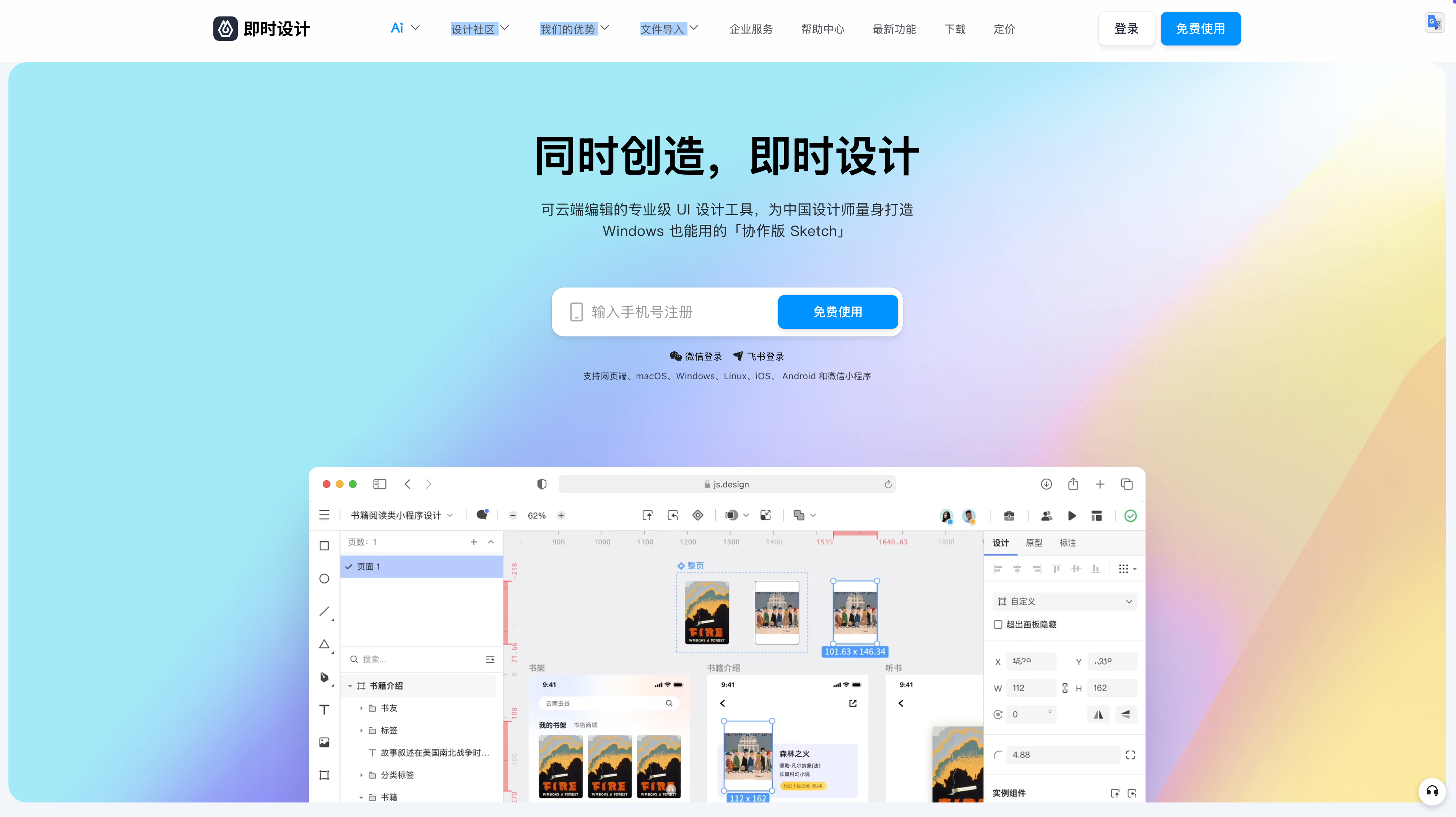
🇨🇳 Recommended Tools (China-Friendly):
- 即时设计 (JS Design) (recommended, free) - js.design
- Full-featured design tool with Figma-like functionality
- Perfect for Chinese users with fast access and local support
- MasterGo (collaborative design) - mastergo.com
- Professional design tool with team collaboration
- Pixso (all-in-one design) - pixso.cn
- Comprehensive design and prototyping platform
- MockingBot (prototyping focused) - mockingbot.com
- Specialized in interactive prototypes
🌍 International Alternatives:
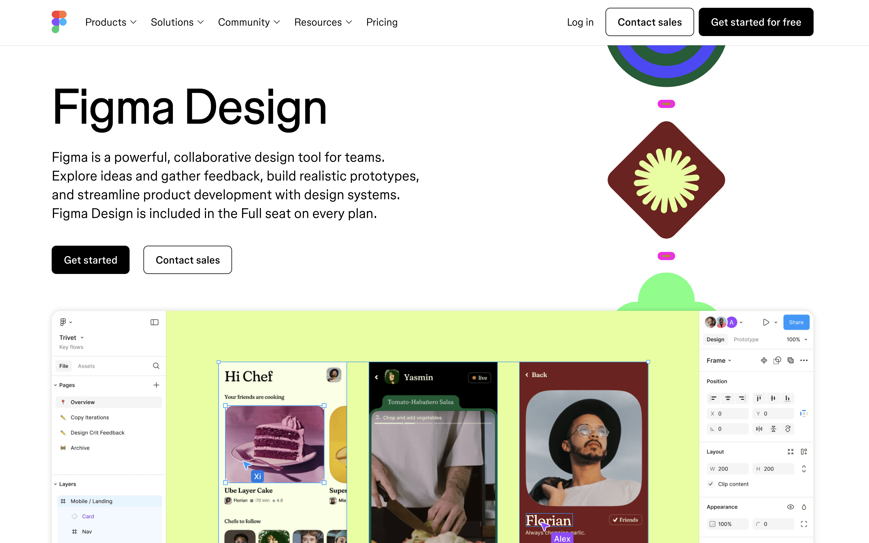
- Figma (limited in China) - figma.com
- Note: Dominant in Western markets but restricted access in China
- Sketch (Mac only, paid) - sketch.com
- Balsamiq (wireframe-focused) - balsamiq.com
- Wireframe.cc (quick wireframes) - wireframe.cc
- Specialized wireframing tool with simplified interface
💡 Tool Recommendations:
Primary Recommendation (China-based course):
- 即时设计 (JS Design) - js.design - Best choice for this course
- Full Figma-like functionality with fast China access
- Free tier with professional features
- Local support and Chinese interface
- Excalidraw - excalidraw.com - For quick sketches
- Wireframe.cc - wireframe.cc - For focused wireframing
Alternative Options:
- MasterGo for team collaboration projects
- Pixso for comprehensive design workflows
- Figma (if accessible) for international compatibility
Design Process: Wireframe → Mockup → Prototype
Understanding the progression from wireframe to final product is crucial:
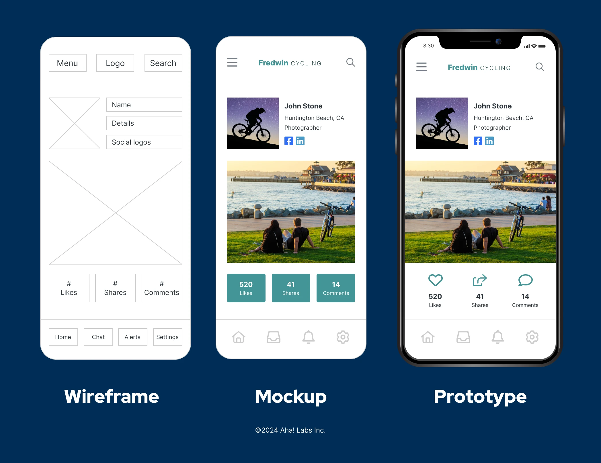
The Design Sequence:
- Wireframe - Structure and layout (what we're learning here)
- Mockup - Visual design with colors, typography, images
- Prototype - Interactive version with clickable elements
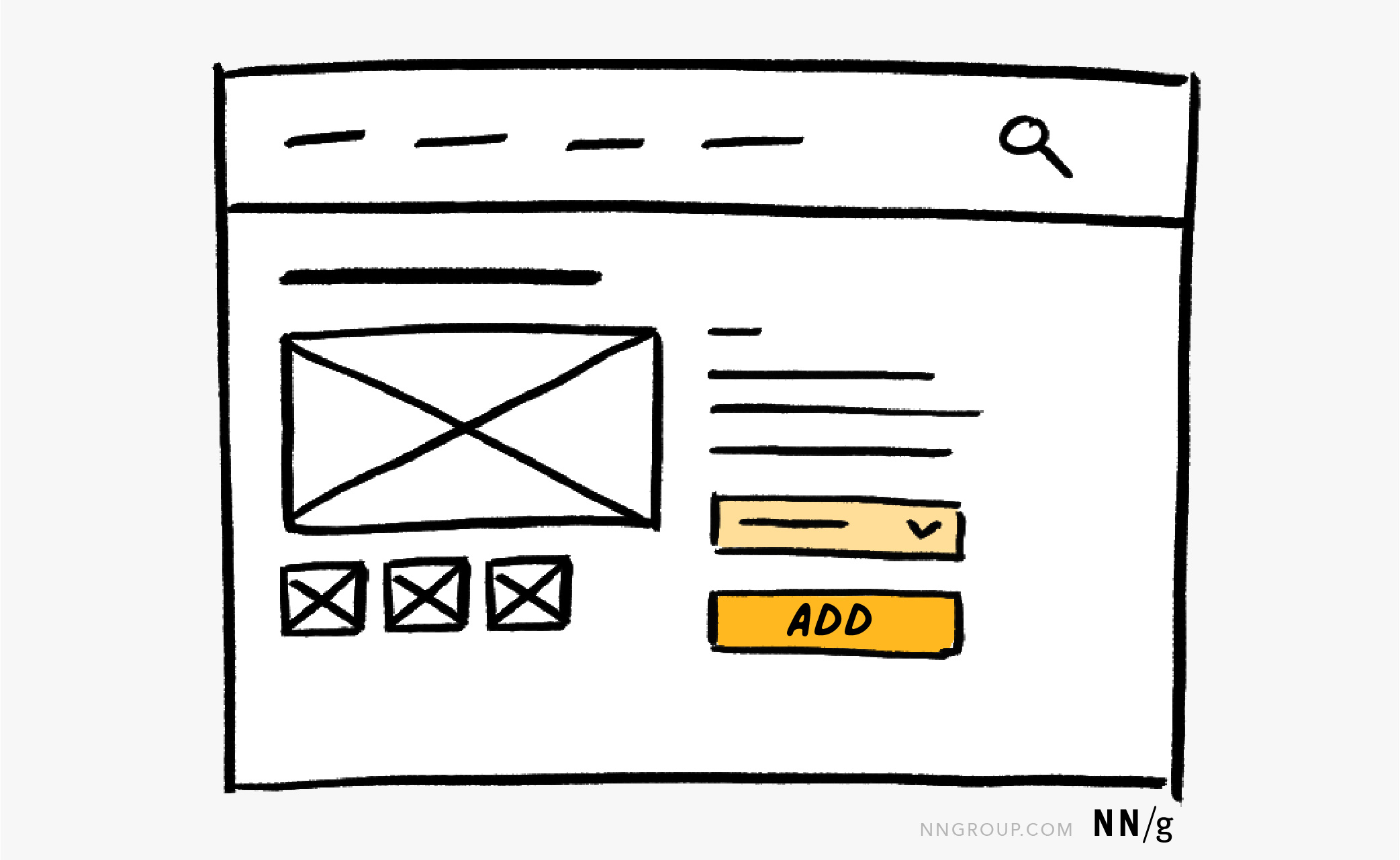
Hi-Fi Wireframe Examples:
These wireframes show more detailed layouts with realistic content and visual hierarchy:
Desktop Website Wireframe (Professional Layout):
This professional wireframe shows a complete desktop layout with clear navigation, hero section, and content areas suitable for business websites.
Quick Wireframing Tool (Wireframe.cc):
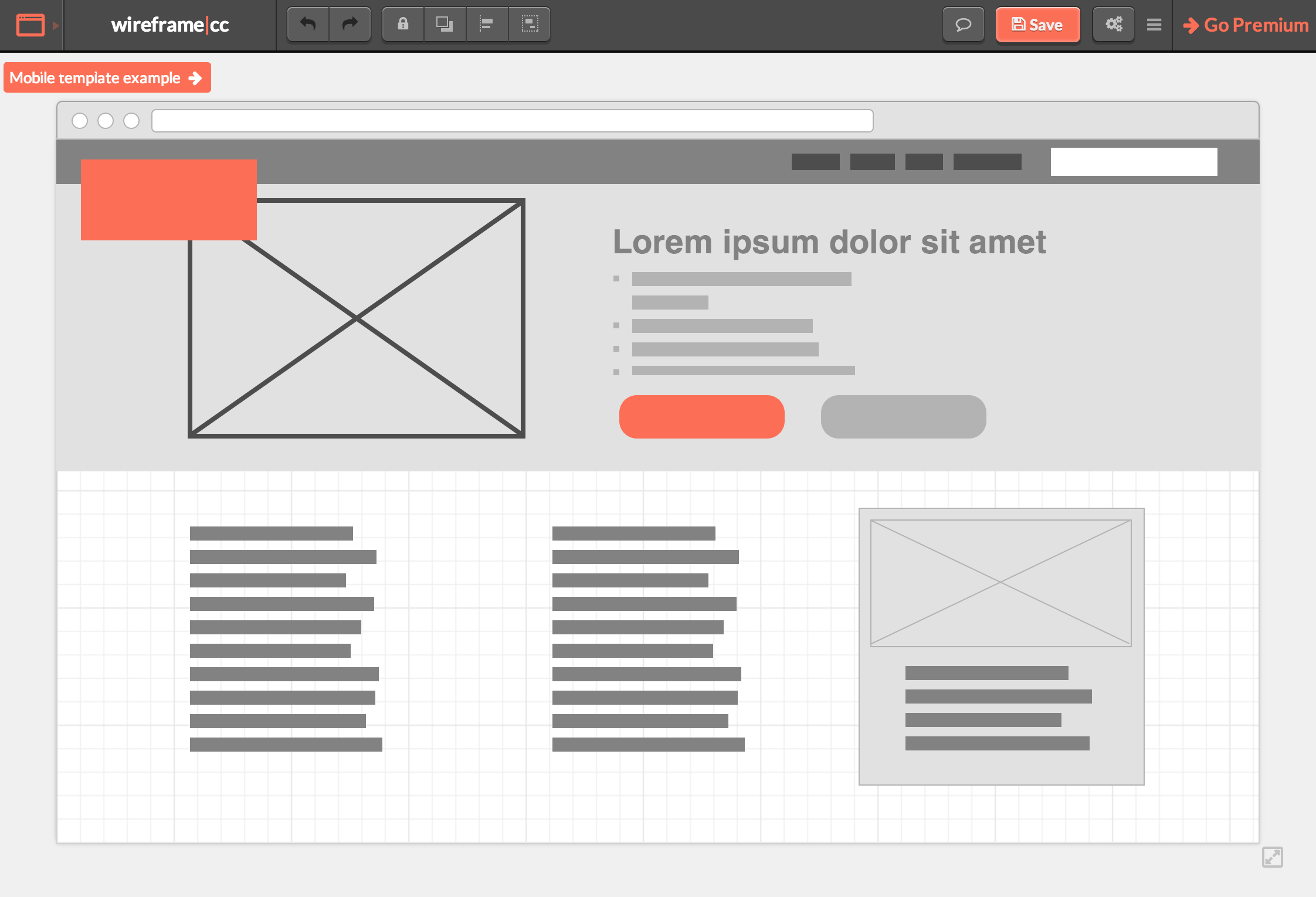
For quick wireframes, use Wireframe.cc - a specialized tool designed specifically for wireframing with essential tools made simpler and smarter. Perfect for rapid iteration and focusing on structure without getting distracted by unnecessary details.
3. Content Planning & Sitemap
Creating a Sitemap
A sitemap shows all pages and their relationships.
Personal Portfolio Example:
Homepage (index.html)
├── About Me (about.html)
│ ├── Resume/CV (resume.pdf)
│ └── Skills & Tools
├── Projects (projects.html)
│ ├── Project 1 (project-1.html)
│ ├── Project 2 (project-2.html)
│ └── Project 3 (project-3.html)
├── Blog (blog.html)
│ ├── Article 1 (blog/article-1.html)
│ └── Article 2 (blog/article-2.html)
└── Contact (contact.html)
└── Thank You (contact/thank-you.html)
Content Inventory
For each page, list:
- Required Content
- Headings and subheadings
- Body text and descriptions
- Images and media
- Call-to-action buttons
- Homepage Content Checklist:
□ Hero section with headline □ Brief introduction (2-3 sentences) □ Featured projects (3-6 items) □ Skills overview □ Contact CTA □ Social media links □ Profile photo - Project Page Content:
□ Project title □ Description (problem, solution, results) □ Technologies used □ Screenshots/demo video □ Live link and GitHub repo □ Challenges overcome □ Lessons learned
4. Color Scheme Selection
Color Theory Basics
Primary Color Concepts:
- Color Wheel Relationships
- Complementary: Opposite colors (blue + orange)
- Analogous: Adjacent colors (blue + teal + green)
- Triadic: Three evenly spaced colors (red + blue + yellow)
- Monochromatic: Shades of one color
- Color Psychology for Web
Blue: Trust, professionalism (tech companies) Green: Growth, health, money (finance, eco) Red: Energy, urgency, passion (sales, food) Purple: Creativity, luxury (design, premium) Orange: Friendliness, enthusiasm (social, fun) Gray: Neutral, modern, sophisticated
Choosing Your Palette
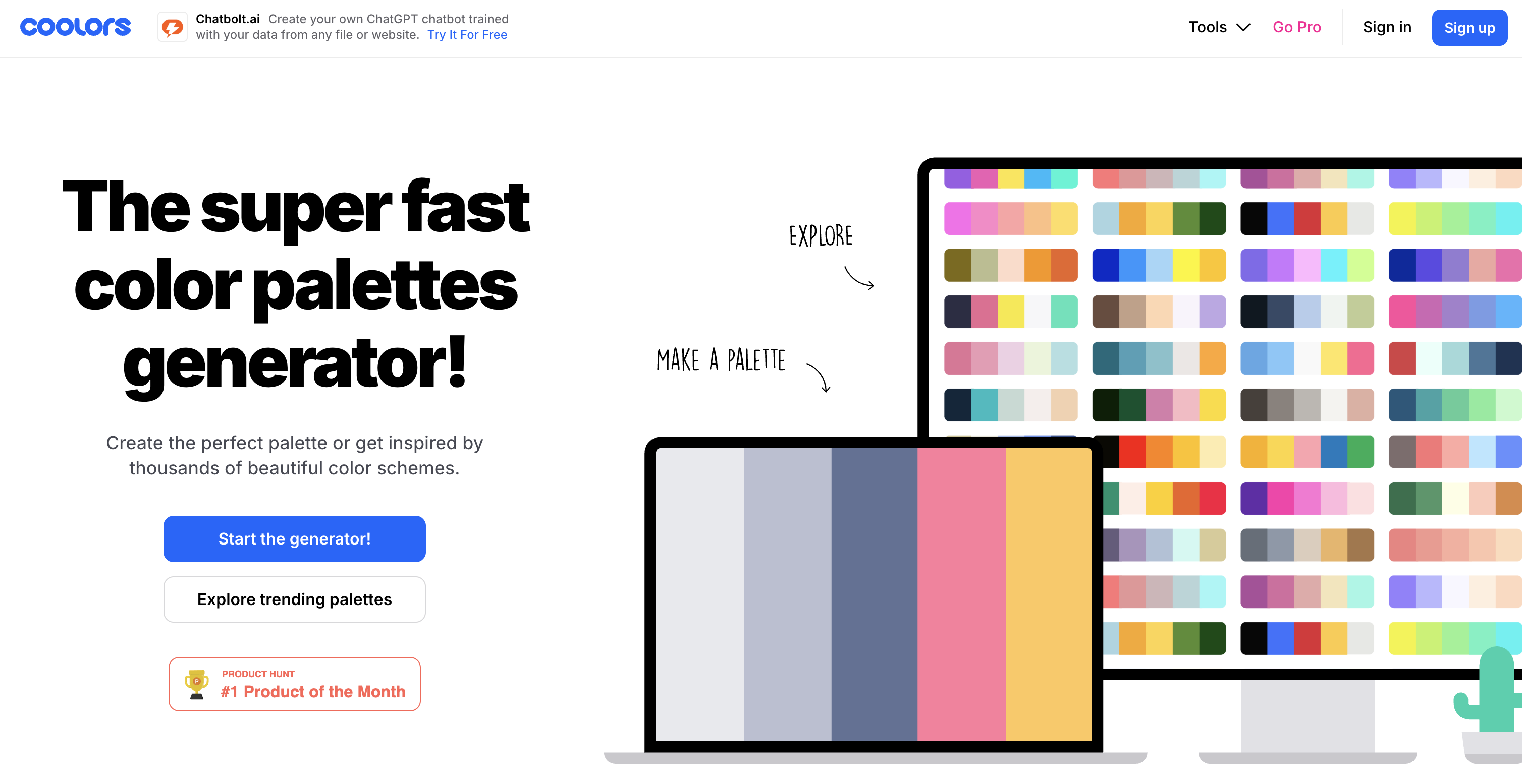
Color Palette Tools:
Use Coolors.co - the super fast color palette generator that's used by 5+ million designers. Features include:
- Palette Generator: Create perfect palettes in seconds
- Explore Palettes: Browse millions of trending color schemes
- Image Picker: Extract beautiful palettes from your photos
- Contrast Checker: Ensure accessibility compliance
- Palette Visualizer: Preview colors on real designs
60-30-10 Rule:
- 60% Primary (main background/brand color)
- 30% Secondary (supporting sections)
- 10% Accent (buttons, links, highlights)
Example Portfolio Palette:
/* Primary - Professional Blue */
--primary: #2563eb; /* Main brand color */
--primary-dark: #1e40af; /* Hover states */
--primary-light: #dbeafe; /* Backgrounds */
/* Secondary - Neutral Gray */
--secondary: #64748b; /* Text, borders */
--gray-light: #f1f5f9; /* Section backgrounds */
--gray-dark: #1e293b; /* Headings */
/* Accent - Vibrant Orange */
--accent: #f59e0b; /* CTAs, highlights */
--accent-hover: #d97706; /* Button hover */
/* Utility Colors */
--white: #ffffff;
--black: #000000;
--success: #10b981; /* Success messages */
--error: #ef4444; /* Error states */
Color Tools
Recommended Tools:
- Coolors.co - Generate palettes
- Adobe Color - Color wheel tool
- Color Hunt - Curated palettes
- WebAIM Contrast Checker - Accessibility testing
Contrast Requirements (WCAG):
- Normal text: 4.5:1 minimum
- Large text (18px+): 3:1 minimum
- UI components: 3:1 minimum
Good Contrast: #2563eb on #ffffff (8.59:1) ✓
Bad Contrast: #93c5fd on #ffffff (1.93:1) ✗
5. Typography Choices for Web
"Web Design is 95% Typography"
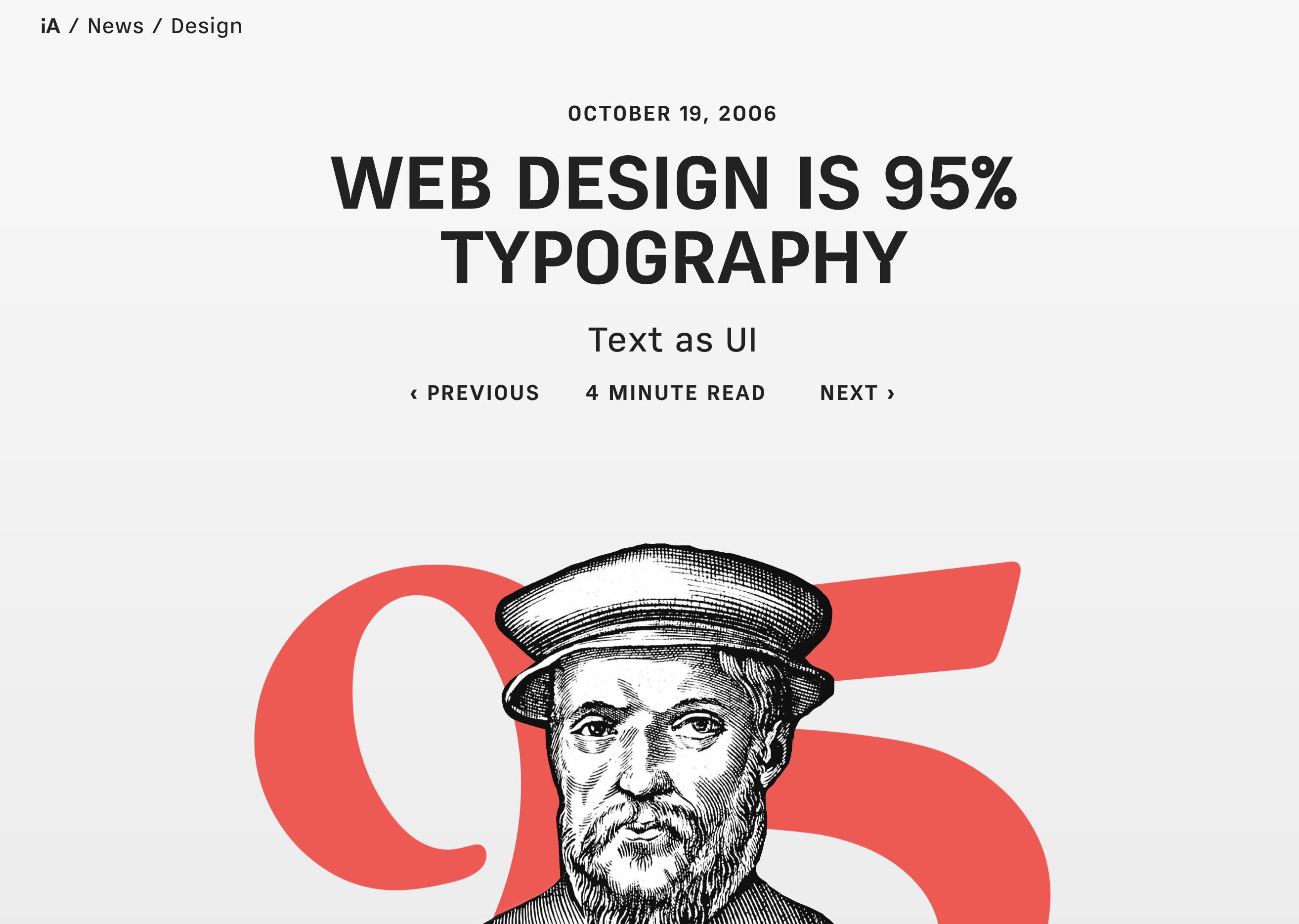
As Swiss UI designer Oliver Reichenstein famously stated in his influential article "Web Design is 95% Typography":
"95% of the information on the web is written language. It is only logical to say that a web designer should get good training in the main discipline of shaping written information, in other words: Typography."
Reichenstein argues that typography is not just about choosing fonts, but about treating text as a user interface. He emphasizes that:
- Typography is Information Architecture: How we organize and present text directly affects user experience
- Readability is Usability: Good typography improves accessibility and overall usability
- Text as Interface: Successful websites treat text not just as content, but as an interactive interface element
- Macro vs Micro Typography: Web designers handle both the big picture (layout, hierarchy) and details (spacing, readability)
This principle guides our approach to typography in web design - it's not decoration, it's the foundation of user experience.
Font Selection Principles
Font Categories:
- Serif - Traditional, formal
Georgia, Times New Roman, Merriweather Use: Long-form content, print-like feel - Sans-Serif - Modern, clean
Arial, Helvetica, Inter, Roboto Use: UI, headings, body text (most common) - Monospace - Code, technical
Courier, Consolas, Fira Code Use: Code blocks, technical content - Display/Decorative - Special purposes
Use sparingly: Logos, large headings only
Font Pairing Strategy
Classic Combinations:
/* Combination 1: Clean & Professional */
--heading-font: 'Inter', sans-serif;
--body-font: 'Inter', sans-serif;
/* Same font family, different weights */
/* Combination 2: Elegant Contrast */
--heading-font: 'Playfair Display', serif;
--body-font: 'Source Sans Pro', sans-serif;
/* Serif headings, sans-serif body */
/* Combination 3: Tech/Modern */
--heading-font: 'Space Grotesk', sans-serif;
--body-font: 'IBM Plex Sans', sans-serif;
--code-font: 'Fira Code', monospace;
Typography Scale
Establish a size hierarchy:
/* Font Sizes (responsive) */
--text-xs: 0.75rem; /* 12px - Small labels */
--text-sm: 0.875rem; /* 14px - Secondary text */
--text-base: 1rem; /* 16px - Body text */
--text-lg: 1.125rem; /* 18px - Large body */
--text-xl: 1.25rem; /* 20px - H6 */
--text-2xl: 1.5rem; /* 24px - H5 */
--text-3xl: 1.875rem; /* 30px - H4 */
--text-4xl: 2.25rem; /* 36px - H3 */
--text-5xl: 3rem; /* 48px - H2 */
--text-6xl: 3.75rem; /* 60px - H1/Hero */
Web Font Sources:
- Google Fonts (free, easy to use)
- Adobe Fonts (requires subscription)
- Font Squirrel (free, high-quality)
6. Prototyping Tools
Figma (Recommended)
Why Figma:
- Free for personal use
- Browser-based (no installation)
- Collaborative
- Component system
- Export to code
Quick Start Workflow:
- Create New Design File
- Create account at figma.com
- New Design File → Desktop (1440 × 1024)
- Build Layout
- Use Frames (F) for sections
- Rectangle (R) for boxes
- Text (T) for content
- Auto Layout for responsive elements
- Design System
- Define color styles
- Create text styles
- Build reusable components
- Prototype Interactions
- Link frames together
- Add hover states
- Create click interactions
Figma Shortcuts:
F - Frame R - Rectangle
T - Text O - Ellipse
Ctrl+D - Duplicate Ctrl+G - Group
Ctrl+/ - Search Shift+A - Auto Layout
Excalidraw (Quick Sketches)
Why Excalidraw:
- Extremely simple
- Hand-drawn style
- Perfect for lo-fi wireframes
- Free and open-source
Use Cases:
- Quick idea sketches
- Team brainstorming
- Whiteboard-style diagrams
- Flow charts
Access: excalidraw.com (no account needed)
7. Creating Mood Boards
A mood board collects visual inspiration for your design.
What to Include
Visual Elements:
- Color palettes (2-3 examples)
- Typography samples (font pairings)
- Website screenshots (similar style)
- UI patterns (buttons, cards, navigation)
- Photography style (images you like)
- Textures/backgrounds
- Icons and graphics style
Example Mood Board Structure:
┌─────────────────────────────────────────┐
│ Personal Portfolio Mood Board │
├─────────────────────────────────────────┤
│ Colors: [Deep Blue] [Coral] [Cream] │
│ │
│ Typography: Inter (headings) │
│ Source Sans (body) │
│ │
│ Inspiration Sites: │
│ [Screenshot: clean minimal portfolio] │
│ [Screenshot: gradient hero section] │
│ │
│ UI Elements: │
│ [Rounded buttons] [Card layouts] │
│ [Smooth animations] [Dark mode toggle] │
└─────────────────────────────────────────┘
Mood Board Tools
- Pinterest - Collect pins
- Figma/Miro - Arrange visuals
- Notion - Organize with notes
- Dribbble/Behance - Find design inspiration
8. Complete Planning Example: Personal Homepage
Let's plan a portfolio homepage step-by-step.
Step 1: Define Goals
Project: Personal Developer Portfolio
Goal: Showcase 3 best projects to attract freelance clients
Audience: Small business owners, startups (age 30-50)
Timeline: 2 weeks
Budget: Free tools only
Step 2: Create Sitemap
Homepage (/)
├── Hero section
├── Featured projects (3)
├── About snippet
└── Contact CTA
About (/about)
├── Bio
├── Skills
└── Experience
Projects (/projects)
├── All projects grid
└── Individual project pages
Contact (/contact)
└── Contact form
Step 3: Wireframe Homepage
┌─────────────────────────────────────────┐
│ [LOGO] Home About Projects │
├─────────────────────────────────────────┤
│ │
│ Full-Stack Web Developer │
│ I help businesses grow online │
│ │
│ [View Projects ↓] [Contact] │
│ (Gradient background with photo) │
├─────────────────────────────────────────┤
│ Featured Work │
│ │
│ ┌───────┐ ┌───────┐ ┌───────┐ │
│ │Project│ │Project│ │Project│ │
│ │ Img │ │ Img │ │ Img │ │
│ │Title │ │Title │ │Title │ │
│ │Tech │ │Tech │ │Tech │ │
│ │[View] │ │[View] │ │[View] │ │
│ └───────┘ └───────┘ └───────┘ │
├─────────────────────────────────────────┤
│ About Me │
│ [Photo] Brief introduction text │
│ Skills: HTML, CSS, JS, etc. │
│ │
├─────────────────────────────────────────┤
│ Ready to start your project? │
│ [Get in Touch →] │
├─────────────────────────────────────────┤
│ © 2025 | Email | GitHub | LinkedIn │
└─────────────────────────────────────────┘
Step 4: Color Scheme
/* Professional Tech Palette */
--primary: #0f172a; /* Dark blue-gray (backgrounds) */
--secondary: #6366f1; /* Indigo (brand color) */
--accent: #f59e0b; /* Amber (CTAs) */
--text: #334155; /* Slate gray (body text) */
--bg: #f8fafc; /* Light gray (page background) */
Step 5: Typography
/* Google Fonts */
@import url('https://fonts.googleapis.com/css2?family=Inter:wght@400;600;700&display=swap');
--font-heading: 'Inter', sans-serif;
--font-body: 'Inter', sans-serif;
/* Sizes */
h1 { font-size: 3rem; font-weight: 700; }
h2 { font-size: 2rem; font-weight: 600; }
body { font-size: 1rem; line-height: 1.6; }
Step 6: Content Planning
Homepage Content:
Hero:
- Headline: "Full-Stack Developer & Problem Solver"
- Subheading: "I build fast, accessible web applications"
- CTA: "View My Work" (scroll to projects)
Projects (3 featured):
1. E-commerce Platform (Vue.js, Node.js)
2. Task Management App (React, MongoDB)
3. Portfolio Site (Nuxt, TailwindCSS)
About snippet:
"With 5 years in Python, I transitioned to web development
to create user-facing solutions. I specialize in Vue.js
and modern JavaScript frameworks."
Contact CTA:
"Let's build something great together. Get in touch!"
9. Practical Exercises
Exercise 1.1: Define Your Project
Create a planning document with:
- Project goal statement
- Target audience persona (age, needs, devices)
- Success metrics (what does success look like?)
- Timeline and milestones
Exercise 1.2: Create a Sitemap
Draw a sitemap for your personal homepage including:
- Homepage structure
- At least 3 other pages (About, Projects, Contact)
- Show page hierarchy and relationships
- List required content for each page
Exercise 1.3: Wireframe Your Homepage
Create both:
- Lo-Fi Wireframe (pen and paper or ASCII art)
- Hi-Fi Wireframe in Figma showing:
- Exact layout
- Navigation placement
- Content sections
- Call-to-action buttons
Exercise 1.4: Design System Setup
Choose and document:
- Color Scheme (3-5 colors with hex codes)
- Typography (heading and body fonts)
- Test contrast (ensure accessibility)
- Create a style guide document
Exercise 1.5: Mood Board Creation
Build a mood board with:
- 3-5 inspiring website screenshots
- Your color palette
- Typography examples
- UI patterns you want to use
- Brief notes on why you chose each
10. Knowledge Check
Question 1: What's the difference between lo-fi and hi-fi wireframes?
Show answer
Lo-fi wireframes are simple sketches with boxes and placeholder text, focusing on layout. Hi-fi wireframes include realistic proportions, actual content, colors, and detailed design elements.Question 2: What is the 60-30-10 color rule?
Show answer
60% primary color (backgrounds), 30% secondary color (supporting sections), 10% accent color (CTAs and highlights). This creates visual hierarchy and balance.Question 3: Why is understanding your target audience important?
Show answer
It determines design choices (devices they use, technical expertise, information needs), content priorities, and user experience decisions.Question 4: What's the minimum contrast ratio for normal text (WCAG)?
Show answer
4.5:1 for normal text, 3:1 for large text (18px+). This ensures readability for users with visual impairments.Question 5: What should a sitemap include?
Show answer
All website pages, their hierarchy and relationships, navigation structure, and how users move between pages.11. Common Planning Mistakes
Skipping the Planning Phase
Problem:
Starting to code immediately without a plan
→ Redesigning multiple times
→ Wasted time and frustration
Solution: Spend 20% of project time on planning
Too Many Colors
Bad palette (7 colors):
--color-1: #ff0000;
--color-2: #00ff00;
--color-3: #0000ff;
--color-4: #ffff00;
--color-5: #ff00ff;
/* Too many! Confusing and inconsistent */
Good palette (3-5 colors):
--primary: #2563eb;
--secondary: #64748b;
--accent: #f59e0b;
/* Clean, cohesive, professional */
Ignoring Mobile Users
Bad planning:
Only wireframe desktop version
→ Mobile users get poor experience
Good planning:
Wireframe both desktop AND mobile
→ Mobile-first approach
→ Responsive from the start
Vague Content Planning
Bad:
"Some text about me"
"Pictures of projects"
"Contact stuff"
Good:
"150-word bio highlighting web dev journey"
"3 project screenshots (800x600px) with descriptions"
"Contact form: name, email, message fields + reCAPTCHA"
12. Planning Checklist
Before starting to code, ensure you have:
Strategy & Goals:
□ Clear project goals defined
□ Target audience identified
□ Success metrics established
□ Timeline created
Information Architecture:
□ Complete sitemap created
□ Content inventory for each page
□ Navigation structure planned
□ User flow mapped out
Design System:
□ Color palette chosen (3-5 colors)
□ Typography selected (2-3 fonts max)
□ Contrast tested for accessibility
□ Style guide documented
Wireframes & Prototypes:
□ Lo-fi wireframes sketched
□ Hi-fi mockups created in Figma
□ Mobile and desktop versions
□ Mood board for inspiration
Content Ready:
□ Text content written or outlined
□ Images collected or sourced
□ Icons/graphics identified
□ Calls-to-action defined
13. Key Takeaways
- Planning saves time - 1 hour planning saves 5+ hours coding/redesigning
- Know your audience - Design decisions should serve user needs
- Wireframe first - Start lo-fi, refine to hi-fi before coding
- Color psychology matters - Choose colors that match your message
- Limit your palette - 3-5 colors maximum for cohesion
- Typography hierarchy - Use consistent font sizes and weights
- Test contrast - Ensure 4.5:1 ratio for accessibility
- Create a sitemap - Plan all pages and navigation
- Content before code - Know what you're building before you build it
- Use professional tools - JS Design for hi-fi, Excalidraw for lo-fi
14. Further Resources
Design Tools:
- 即时设计 (JS Design) - Recommended design tool for China
- Excalidraw - Simple collaborative wireframing
- Wireframe.cc - Specialized wireframing tool
- Figma - International design standard (limited in China)
- Coolors - Color palette generator
China-Friendly Alternatives:
- MasterGo - Collaborative design platform
- Pixso - All-in-one design tool
- MockingBot - Prototyping specialist
Color & Typography:
- Adobe Color - Color wheel tool
- Google Fonts - Free web fonts
- WebAIM Contrast Checker - Accessibility testing
Inspiration:
Learning:
- Laws of UX - UX principles
- Refactoring UI - Design tips
Next Steps
Excellent work! You now understand how to plan and prototype a website before writing code. This foundation will guide all your development decisions.
In Lesson 2: Personal Homepage Structure, you'll transform your plans into HTML, creating the file structure and semantic markup for your portfolio.