5.3: Content & Navigation
Create compelling, scannable web content and implement effective navigation systems for your website. Learn writing techniques for the web, content hierarchy, and how to build intuitive navigation menus.
1. Writing Web-Friendly Content
Web readers scan rather than read. Write accordingly.
The F-Pattern Reading Behavior
How users read web pages:
Understanding user reading patterns helps you design better layouts:
Desktop Reading Pattern:
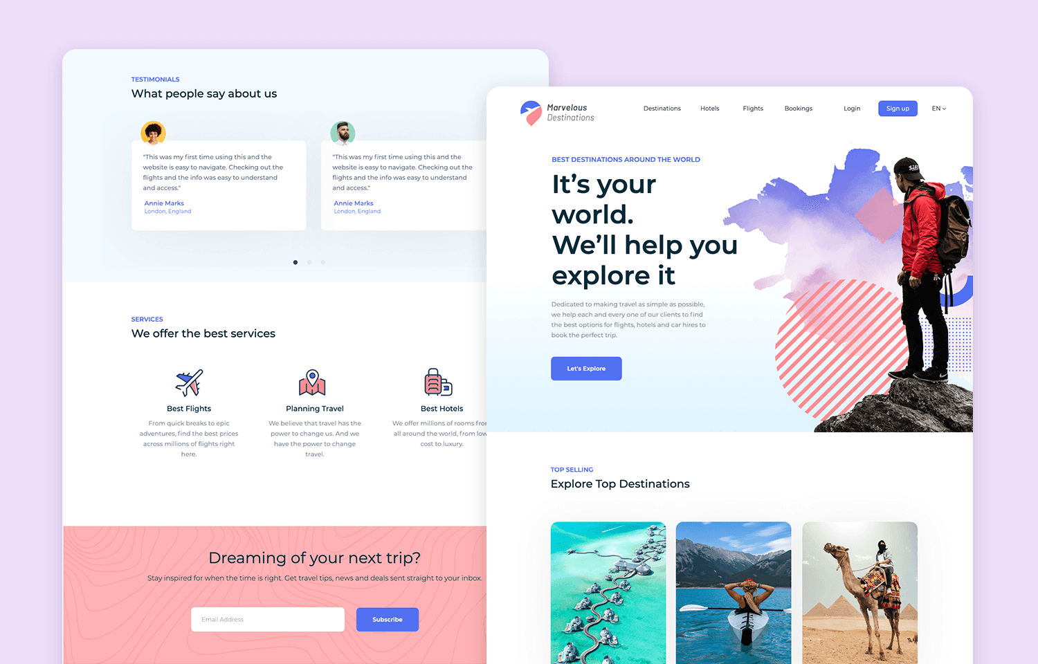
Users scan in an F-pattern: headlines first, then the beginning of paragraphs, and key points. Notice how the wireframe accommodates this with clear hierarchy.
Mobile Reading Pattern:
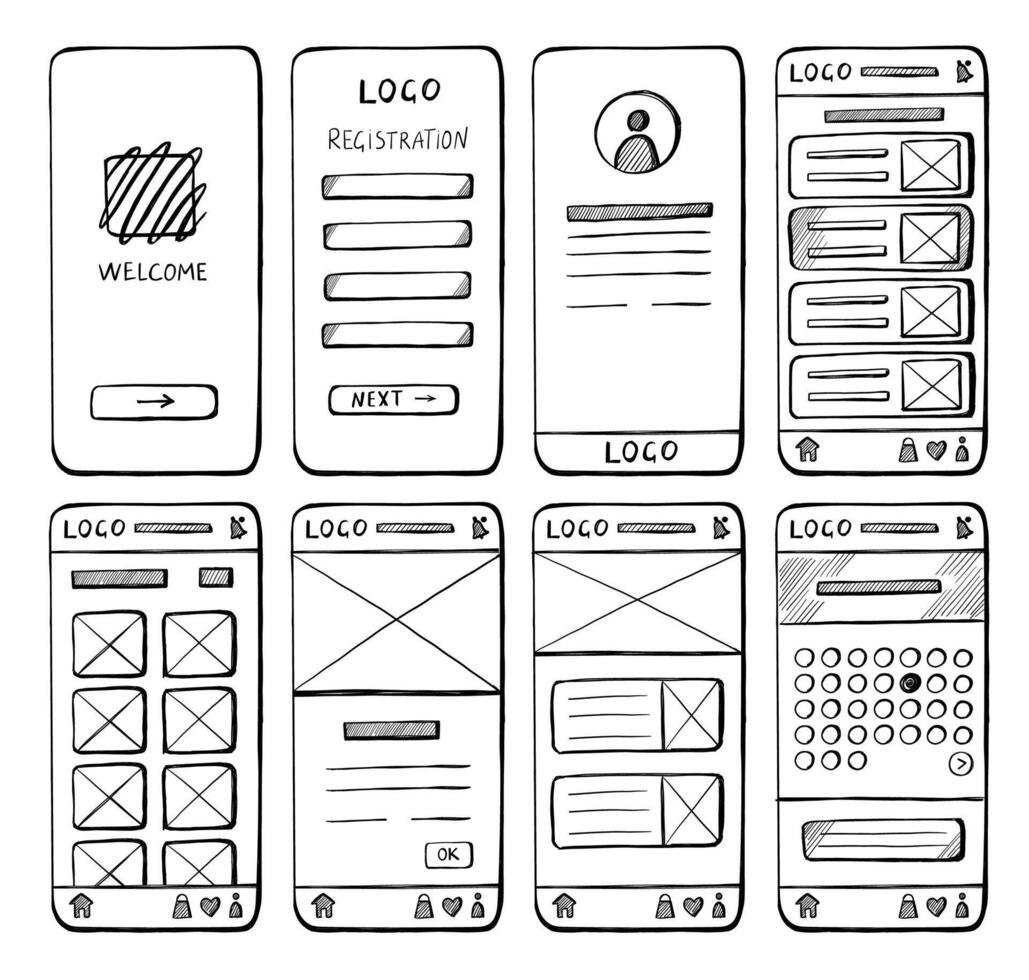
On mobile, users scroll vertically and tap elements. This wireframe shows touch-friendly buttons and vertical content flow.
Users focus on:
- Headlines and subheadings
- First few words of paragraphs
- Bullet points and lists
- Bold text and links
- Images with captions
Content Writing Principles
1. Front-Load Important Information
Bad (buried lead):
I've been working in web development for several years now,
having started my career in Python development before
transitioning to web technologies. Currently, I specialize
in building fast, accessible Vue.js applications.
Good (key info first):
I build fast, accessible Vue.js applications. With 5 years
of Python experience, I transitioned to web development to
create better user experiences.
2. Use Short Paragraphs
Bad (wall of text):
Long paragraph with 8-10 sentences all combined into one
block that's difficult to scan and exhausting to read on
screen because there's no visual break and users will skip
it entirely because it looks like too much work...
Good (scannable):
Short opening sentence.
Second paragraph with 2-3 sentences. This makes content
easier to digest and encourages reading.
Third point with supporting detail. Notice how white space
makes this more inviting?
3. Use Active Voice
Passive voice (weak):
The website was built by me using Vue.js.
Projects have been completed for various clients.
Active voice (strong):
I built the website using Vue.js.
I completed projects for various clients.
4. Write Scannable Content
Before (hard to scan):
<p>
My skills include HTML5, CSS3, JavaScript ES6+, Vue.js,
Nuxt, React, Next.js, Node.js, Express, MongoDB,
PostgreSQL, Git, Docker, and Figma.
</p>
After (scannable with lists):
<h3>Skills</h3>
<ul>
<li><strong>Frontend:</strong> HTML5, CSS3, JavaScript, Vue.js, React</li>
<li><strong>Backend:</strong> Node.js, Express, Python, FastAPI</li>
<li><strong>Database:</strong> MongoDB, PostgreSQL</li>
<li><strong>Tools:</strong> Git, Docker, Figma</li>
</ul>
Content Length Guidelines
Homepage sections:
Hero headline: 3-8 words
Hero subheadline: 10-20 words
Section intro: 1-2 sentences (20-40 words)
Project description: 50-100 words
About snippet: 75-150 words
About page:
Page intro: 100-150 words
Bio sections: 150-250 words each
Total page: 500-800 words maximum
Project details:
Overview: 100-150 words
Challenges: 75-100 words
Solution: 100-150 words
Results: 50-75 words (use metrics!)
2. Content Hierarchy & Organization
Structure content for maximum clarity and impact.
Visual Hierarchy Elements
Heading levels create structure:
<h1>Portfolio</h1> <!-- Page title: ONE per page -->
<h2>Featured Projects</h2> <!-- Major sections -->
<h3>E-commerce Platform</h3> <!-- Subsections/items -->
<h4>Technical Details</h4> <!-- Sub-subsections -->
Visual Hierarchy Examples:
These wireframes demonstrate proper content hierarchy and organization:
Desktop Content Hierarchy:
Notice the clear visual hierarchy: large headlines (H1), section headers (H2), project titles (H3), and supporting details (H4). The layout guides users through content logically.
Mobile Content Organization:
Mobile layouts stack content vertically while maintaining hierarchy through typography size and spacing. Notice how buttons and interactive elements are sized for touch.
Information Architecture for Portfolio
Homepage content priority:
1. HERO (Highest priority)
- Who you are (headline)
- What you do (subheadline)
- Primary CTA (View Work / Contact)
2. FEATURED PROJECTS (High priority)
- 3-6 best projects
- Visual thumbnails
- Brief descriptions
- Links to details
3. ABOUT SNIPPET (Medium priority)
- Brief introduction
- Key skills
- Link to full about page
4. CONTACT CTA (Medium priority)
- Clear call-to-action
- Easy path to contact
5. FOOTER (Low priority)
- Navigation links
- Social media
- Copyright info
Content Organization Patterns
Problem-Solution-Result Pattern (for projects):
<article class="project">
<h3>E-commerce Platform</h3>
<!-- PROBLEM -->
<section class="challenge">
<h4>The Challenge</h4>
<p>
Local boutique needed an online store to reach
customers during lockdown...
</p>
</section>
<!-- SOLUTION -->
<section class="solution">
<h4>The Solution</h4>
<p>
Built a full-featured e-commerce platform with
inventory management, payment processing...
</p>
</section>
<!-- RESULT -->
<section class="results">
<h4>The Results</h4>
<ul>
<li>500+ orders in first month</li>
<li>30% revenue increase</li>
<li>95% customer satisfaction</li>
</ul>
</section>
</article>
3. Navigation Menu Implementation
Horizontal Navigation (Desktop)
Basic horizontal nav:
<nav class="main-nav">
<ul>
<li><a href="index.html" class="active">Home</a></li>
<li><a href="about.html">About</a></li>
<li><a href="projects.html">Projects</a></li>
<li><a href="blog.html">Blog</a></li>
<li><a href="contact.html">Contact</a></li>
</ul>
</nav>
CSS for horizontal layout:
.main-nav ul {
display: flex;
gap: 2rem;
list-style: none;
margin: 0;
padding: 0;
}
.main-nav a {
text-decoration: none;
color: #334155;
font-weight: 500;
padding: 0.5rem 1rem;
transition: color 0.3s;
}
.main-nav a:hover {
color: #6366f1;
}
.main-nav a.active {
color: #6366f1;
border-bottom: 2px solid #6366f1;
}
Vertical Navigation (Sidebar)
Vertical nav structure:
<nav class="sidebar-nav">
<ul>
<li><a href="#overview">Overview</a></li>
<li><a href="#features">Features</a></li>
<li><a href="#technical">Technical Details</a></li>
<li><a href="#gallery">Gallery</a></li>
<li><a href="#lessons">Lessons Learned</a></li>
</ul>
</nav>
CSS for vertical layout:
.sidebar-nav ul {
list-style: none;
padding: 0;
margin: 0;
}
.sidebar-nav li {
margin-bottom: 0.5rem;
}
.sidebar-nav a {
display: block;
padding: 0.75rem 1rem;
text-decoration: none;
color: #64748b;
border-left: 3px solid transparent;
transition: all 0.3s;
}
.sidebar-nav a:hover,
.sidebar-nav a.active {
color: #0f172a;
border-left-color: #6366f1;
background-color: #f1f5f9;
}
4. Responsive Navigation (Hamburger Menu)
Mobile-First Navigation
HTML structure with mobile toggle:
<header class="site-header">
<div class="container">
<!-- Logo -->
<div class="logo">
<a href="index.html">Portfolio</a>
</div>
<!-- Hamburger button (hidden on desktop) -->
<button class="nav-toggle" aria-label="Toggle navigation">
<span class="hamburger"></span>
</button>
<!-- Navigation menu -->
<nav class="main-nav">
<ul class="nav-menu">
<li><a href="index.html">Home</a></li>
<li><a href="about.html">About</a></li>
<li><a href="projects.html">Projects</a></li>
<li><a href="contact.html">Contact</a></li>
</ul>
</nav>
</div>
</header>
CSS for responsive navigation:
/* Mobile styles (default) */
.site-header {
position: relative;
}
.logo {
font-size: 1.5rem;
font-weight: 700;
}
/* Hamburger button (mobile only) */
.nav-toggle {
display: block;
background: none;
border: none;
cursor: pointer;
padding: 0.5rem;
position: absolute;
right: 1rem;
top: 1rem;
}
.hamburger {
display: block;
width: 28px;
height: 3px;
background-color: #0f172a;
position: relative;
}
.hamburger::before,
.hamburger::after {
content: '';
display: block;
width: 28px;
height: 3px;
background-color: #0f172a;
position: absolute;
}
.hamburger::before { top: -8px; }
.hamburger::after { top: 8px; }
/* Mobile navigation (hidden by default) */
.nav-menu {
display: none;
flex-direction: column;
position: absolute;
top: 100%;
left: 0;
right: 0;
background-color: white;
box-shadow: 0 4px 6px rgba(0, 0, 0, 0.1);
padding: 1rem 0;
}
.nav-menu.active {
display: flex;
}
.nav-menu li {
list-style: none;
}
.nav-menu a {
display: block;
padding: 1rem 1.5rem;
text-decoration: none;
color: #0f172a;
}
/* Desktop styles (768px and up) */
@media (min-width: 768px) {
.nav-toggle {
display: none; /* Hide hamburger on desktop */
}
.nav-menu {
display: flex; /* Show nav */
flex-direction: row;
position: static;
box-shadow: none;
padding: 0;
}
.nav-menu a {
padding: 0.5rem 1rem;
}
}
JavaScript for toggle functionality:
// Toggle mobile navigation
const navToggle = document.querySelector('.nav-toggle');
const navMenu = document.querySelector('.nav-menu');
navToggle.addEventListener('click', () => {
navMenu.classList.toggle('active');
// Update aria-expanded for accessibility
const isExpanded = navMenu.classList.contains('active');
navToggle.setAttribute('aria-expanded', isExpanded);
});
// Close menu when clicking outside
document.addEventListener('click', (event) => {
if (!event.target.closest('.site-header')) {
navMenu.classList.remove('active');
navToggle.setAttribute('aria-expanded', 'false');
}
});
5. Breadcrumbs & Page Indicators
Breadcrumb Navigation
HTML structure:
<nav class="breadcrumbs" aria-label="Breadcrumb">
<ol>
<li><a href="index.html">Home</a></li>
<li><a href="projects.html">Projects</a></li>
<li><span aria-current="page">E-commerce Platform</span></li>
</ol>
</nav>
CSS styling:
.breadcrumbs ol {
display: flex;
list-style: none;
padding: 0;
margin: 1rem 0;
font-size: 0.875rem;
}
.breadcrumbs li {
display: flex;
align-items: center;
}
.breadcrumbs li:not(:last-child)::after {
content: '›';
margin: 0 0.5rem;
color: #94a3b8;
}
.breadcrumbs a {
color: #6366f1;
text-decoration: none;
}
.breadcrumbs a:hover {
text-decoration: underline;
}
.breadcrumbs span[aria-current="page"] {
color: #64748b;
}
Visual example:
Home › Projects › E-commerce Platform
Progress Indicators
For multi-step processes:
<nav class="progress-nav" aria-label="Form progress">
<ol class="steps">
<li class="completed">
<span class="step-number">1</span>
<span class="step-label">Contact Info</span>
</li>
<li class="active">
<span class="step-number">2</span>
<span class="step-label">Project Details</span>
</li>
<li>
<span class="step-number">3</span>
<span class="step-label">Review</span>
</li>
</ol>
</nav>
CSS for progress steps:
.steps {
display: flex;
justify-content: space-between;
list-style: none;
padding: 0;
counter-reset: step;
}
.steps li {
flex: 1;
text-align: center;
position: relative;
}
.step-number {
display: inline-block;
width: 36px;
height: 36px;
line-height: 36px;
border-radius: 50%;
background-color: #e2e8f0;
color: #64748b;
font-weight: 600;
}
.steps li.completed .step-number {
background-color: #10b981;
color: white;
}
.steps li.active .step-number {
background-color: #6366f1;
color: white;
}
.step-label {
display: block;
margin-top: 0.5rem;
font-size: 0.875rem;
color: #64748b;
}
.steps li.active .step-label {
color: #0f172a;
font-weight: 600;
}
6. Internal Linking Strategies
Contextual Links
Link to related content:
<p>
My transition from Python to web development wasn't
straightforward. Learn more about
<a href="about.html#journey">my journey</a> and the
<a href="projects.html">projects</a> that helped me grow.
</p>
Related Content Links
At end of project details:
<section class="related-projects">
<h3>Similar Projects</h3>
<ul>
<li>
<a href="project-2.html">
Task Manager App - Another Vue.js project
</a>
</li>
<li>
<a href="project-4.html">
Blog Platform - Full-stack application
</a>
</li>
</ul>
</section>
"Back to Top" Links
For long pages:
<!-- At bottom of long sections -->
<a href="#top" class="back-to-top">↑ Back to Top</a>
<!-- Target at page start -->
<div id="top"></div>
Smooth scroll with CSS:
html {
scroll-behavior: smooth;
}
.back-to-top {
display: inline-block;
padding: 0.5rem 1rem;
background-color: #f1f5f9;
color: #6366f1;
text-decoration: none;
border-radius: 4px;
font-size: 0.875rem;
}
.back-to-top:hover {
background-color: #e2e8f0;
}
7. Call-to-Action (CTA) Design
Effective CTA Principles
1. Use Action Verbs
Weak CTAs:
Click Here
Learn More
Submit
Strong CTAs:
View My Projects
Get Free Quote
Download Resume
Start Your Project
Book a Call
2. Create Urgency (when appropriate)
Get Started Today
Limited Availability - Contact Now
Download Free Guide
3. Make CTAs Stand Out
<!-- Primary CTA (most important action) -->
<a href="contact.html" class="btn btn-primary">
Hire Me
</a>
<!-- Secondary CTA (alternative action) -->
<a href="projects.html" class="btn btn-secondary">
View Portfolio
</a>
CTA Button Styles
HTML for different CTA types:
<!-- Primary CTA -->
<a href="contact.html" class="btn btn-primary">
Get in Touch
</a>
<!-- Secondary CTA -->
<a href="about.html" class="btn btn-secondary">
Learn More About Me
</a>
<!-- Ghost/Outline CTA -->
<a href="projects.html" class="btn btn-outline">
Browse Projects
</a>
<!-- Text link CTA -->
<a href="blog.html" class="btn btn-link">
Read My Blog →
</a>
CSS for CTA buttons:
/* Base button styles */
.btn {
display: inline-block;
padding: 0.75rem 1.5rem;
font-size: 1rem;
font-weight: 600;
text-align: center;
text-decoration: none;
border-radius: 6px;
transition: all 0.3s;
border: 2px solid transparent;
}
/* Primary CTA */
.btn-primary {
background-color: #6366f1;
color: white;
}
.btn-primary:hover {
background-color: #4f46e5;
transform: translateY(-2px);
box-shadow: 0 4px 12px rgba(99, 102, 241, 0.4);
}
/* Secondary CTA */
.btn-secondary {
background-color: #f1f5f9;
color: #0f172a;
}
.btn-secondary:hover {
background-color: #e2e8f0;
}
/* Outline CTA */
.btn-outline {
background-color: transparent;
color: #6366f1;
border-color: #6366f1;
}
.btn-outline:hover {
background-color: #6366f1;
color: white;
}
/* Link-style CTA */
.btn-link {
background: none;
color: #6366f1;
padding: 0;
font-weight: 500;
}
.btn-link:hover {
text-decoration: underline;
}
/* Large CTA */
.btn-large {
padding: 1rem 2rem;
font-size: 1.125rem;
}
/* Small CTA */
.btn-small {
padding: 0.5rem 1rem;
font-size: 0.875rem;
}
CTA Placement Strategy
Homepage CTA hierarchy:
1. Hero Section (PRIMARY)
→ "View My Work" + "Contact Me"
2. End of Projects Section (SECONDARY)
→ "See All Projects"
3. End of About Section (TERTIARY)
→ "Read Full Bio"
4. Page Bottom (PRIMARY)
→ "Ready to Work Together? Get in Touch"
8. Accessibility Features
Skip Links
Allow keyboard users to skip navigation:
<body>
<!-- Skip link (first element in body) -->
<a href="#main-content" class="skip-link">
Skip to main content
</a>
<header>
<!-- Navigation here -->
</header>
<main id="main-content">
<!-- Main content here -->
</main>
</body>
CSS for skip link (visible on focus):
.skip-link {
position: absolute;
top: -40px;
left: 0;
background: #6366f1;
color: white;
padding: 0.5rem 1rem;
text-decoration: none;
z-index: 100;
}
.skip-link:focus {
top: 0;
}
ARIA Labels
Improve screen reader experience:
<!-- Navigation landmark -->
<nav aria-label="Main navigation">
<ul>
<li><a href="index.html">Home</a></li>
<li><a href="about.html">About</a></li>
</ul>
</nav>
<!-- Multiple navs need unique labels -->
<nav aria-label="Breadcrumb">
<!-- Breadcrumbs here -->
</nav>
<nav aria-label="Social media">
<a href="#" aria-label="GitHub profile">
<img src="github-icon.svg" alt="">
</a>
<a href="#" aria-label="LinkedIn profile">
<img src="linkedin-icon.svg" alt="">
</a>
</nav>
<!-- Hamburger menu button -->
<button
class="nav-toggle"
aria-label="Toggle navigation"
aria-expanded="false"
>
<span class="hamburger"></span>
</button>
<!-- Current page indicator -->
<li>
<a href="about.html" aria-current="page">About</a>
</li>
Keyboard Navigation
Ensure all interactive elements are keyboard accessible:
/* Visible focus states */
a:focus,
button:focus {
outline: 2px solid #6366f1;
outline-offset: 2px;
}
/* Remove outline for mouse users, keep for keyboard */
a:focus:not(:focus-visible),
button:focus:not(:focus-visible) {
outline: none;
}
a:focus-visible,
button:focus-visible {
outline: 2px solid #6366f1;
outline-offset: 2px;
}
9. Practical Exercises
Exercise 3.1: Write Scannable Content
Rewrite your About page content to be more scannable:
- Use short paragraphs (2-3 sentences max)
- Add bullet points for skills
- Front-load important information
- Use bold for key terms
- Add descriptive subheadings
Exercise 3.2: Implement Responsive Navigation
Build a mobile-responsive navigation:
- Create horizontal navigation for desktop
- Add hamburger menu for mobile
- Implement JavaScript toggle functionality
- Add smooth transitions
- Test on different screen sizes
Exercise 3.3: Create Breadcrumb Navigation
Add breadcrumbs to your project detail pages:
- HTML structure with proper semantics
- Style with separators (›)
- Show current page (not linked)
- Make it responsive (hide on mobile if needed)
Exercise 3.4: Design Effective CTAs
Create CTA buttons with different styles:
- Primary CTA (filled, bold color)
- Secondary CTA (subtle background)
- Outline CTA (transparent with border)
- Link CTA (text link with arrow)
- Add hover effects and transitions
Exercise 3.5: Implement Accessibility Features
Improve navigation accessibility:
- Add skip link to main content
- Include ARIA labels for navigation
- Ensure keyboard focus is visible
- Test navigation with keyboard only
- Verify screen reader compatibility
10. Knowledge Check
Question 1: What is the F-pattern reading behavior?
Show answer
Users scan web pages in an F-shaped pattern: reading headlines, the first words of paragraphs, and key points. This means important information should be front-loaded.Question 2: How should you structure CTAs for maximum effectiveness?
Show answer
Use action verbs, make buttons stand out visually, create urgency when appropriate, and maintain a clear hierarchy (primary, secondary, tertiary CTAs).Question 3: What's the purpose of a skip link?
Show answer
Skip links allow keyboard users to bypass navigation and jump directly to main content, improving accessibility for screen reader users and keyboard-only navigation.Question 4: When should you use aria-label?
Show answer
Use aria-label when you have multiple navigation elements, icon-only buttons, or when the visible text doesn't adequately describe the element's purpose for screen readers.Question 5: Why is content hierarchy important?
Show answer
It helps users quickly find information, improves scannability, supports accessibility with proper heading structure, and guides users through your content logically.11. Common Navigation Mistakes
Too Many Navigation Items
Bad (overwhelming):
<nav>
<ul>
<li>Home</li>
<li>About</li>
<li>Services</li>
<li>Portfolio</li>
<li>Blog</li>
<li>Testimonials</li>
<li>FAQ</li>
<li>Resources</li>
<li>Contact</li>
</ul>
</nav>
Good (focused):
<nav>
<ul>
<li>Home</li>
<li>About</li>
<li>Projects</li>
<li>Contact</li>
</ul>
</nav>
Vague Link Text
Bad:
<a href="projects.html">Click here</a>
<a href="about.html">More</a>
<a href="contact.html">Link</a>
Good:
<a href="projects.html">View My Projects</a>
<a href="about.html">Read My Story</a>
<a href="contact.html">Get in Touch</a>
Missing Active States
Bad (no indication of current page):
<nav>
<ul>
<li><a href="index.html">Home</a></li>
<li><a href="about.html">About</a></li>
</ul>
</nav>
Good (shows active page):
<nav>
<ul>
<li><a href="index.html" class="active" aria-current="page">Home</a></li>
<li><a href="about.html">About</a></li>
</ul>
</nav>
12. Navigation Checklist
Content Quality:
□ Content is scannable (short paragraphs, bullets)
□ Important information front-loaded
□ Active voice used
□ Clear headings and subheadings
□ Appropriate content length
Navigation Structure:
□ Main navigation with 4-7 items max
□ Current page highlighted
□ Responsive hamburger menu for mobile
□ Consistent across all pages
□ Footer navigation matches header
Internal Linking:
□ Contextual links in content
□ Related content suggestions
□ Breadcrumbs on detail pages
□ "Back to top" on long pages
Call-to-Actions:
□ Clear action verbs used
□ Primary CTA stands out
□ CTAs placed strategically
□ Hover states implemented
□ Mobile-friendly button sizes (min 44x44px)
Accessibility:
□ Skip link to main content
□ ARIA labels on navigation
□ Keyboard navigation works
□ Focus states visible
□ Screen reader friendly
13. Key Takeaways
- Write for scanning - Use short paragraphs, bullets, and front-load information
- Content hierarchy - Use proper heading structure (H1-H6)
- Limit navigation - 4-7 main navigation items maximum
- Mobile-first navigation - Implement hamburger menu for small screens
- Active page states - Highlight current page in navigation
- Strong CTAs - Use action verbs and make buttons stand out
- Skip links - First element in body for accessibility
- ARIA labels - Improve screen reader experience
- Keyboard accessible - All interactive elements must work with keyboard
- Test thoroughly - Verify navigation works on all devices
14. Further Resources
Content Writing:
Navigation Patterns:
Accessibility:
Next Steps
Excellent progress! You've learned how to create scannable content and implement accessible navigation systems. Your portfolio now has professional structure and content organization.
In Lesson 4: Adding Media & Interactive Elements, you'll learn how to optimize images, create galleries, embed videos, and add JavaScript interactions to bring your portfolio to life.